

Guest blog by Mary Pat Campbell FSA, MAAA, PRM
It amazes me how many people use what Microsoft has deemed acceptable default charts in Excel for our graphing needs. Seeing our hard work presented in a cookie-cutter one-size-fits-all graph has to be one of the most disappointing ways to finish a project. For many, the extra time it takes to adjust fonts, line or marker colors, legends, and more just to get to an acceptable graph can seem like time well spent… but did you know that you can save all that hard work and use it again and again?
Here is an example of a default graph in Excel: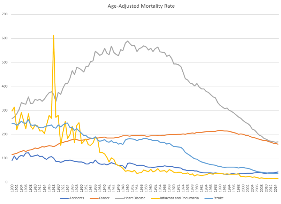 This is using the default line graph for Excel with 5 series. There are multiple problems with this graph:
- The colors are not aesthetically pleasing nor is it accessible to the visually impaired.
- When printed in black & white (which many have to use), the results are muddied as there are similar greyscale results for some of the colors.
- The spacing of the labels on the horizontal axis is too narrow, making it so “busy” as to be nearly useless.
- There is little use for having horizontal lines – we’re not trying to read the mortality rates exactly to the digit and while we need to show approximate scale (the vertical axis labels), the horizontal lines don’t help people “read” the graph
- The title of the graph is better on the vertical axis where it makes abundantly clear what the vertical axis means.
After working to adjust each line, the axis, and more, I crafted this graph: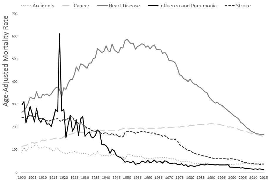
I am willing to bet you like this one much better. But what a pain it would be to have to keep making these adjustments for every one of my graphs! Thank goodness, you can save all the formatting work in a template that you can apply to other graphs. I saved the parameters for the above chart as a template in Excel, and thus, I could create the following:
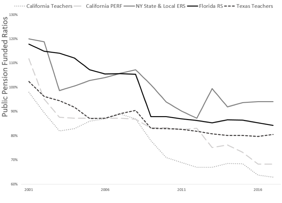 After applying this template, I only needed to type in the vertical scale label and change the lower bound for the vertical axis. Everything else was pre-populated and I didn’t even need to have a precisely matched data series:
 I did need to change the spacing of labels and insert the title — but other than that — I made no changes!
Building your own graph templates can give your graphs a uniform and professional look, saving you from the look of using the built-in Microsoft defaults (which every Excel user can detect). If nothing else, it will show that you go the extra mile to deliver custom work.
I covered making graph templates in Excel, as well as more advanced data visualization topics in Excel, in my ACTEX eLearning Webinar: “Advanced Techniques for Data Visualization in Excel”.